
What Are Core Web Vitals?
Core Web Vitals are more than just technical metrics. Each one reflects how visitors feel when they land on your site, scroll, click, type, and wait for things to happen. Whether you are running an online store, a blog, a news site, or a SaaS product, these vitals influence how easily users can navigate your content and how likely they are to convert.
Google’s current Core Web Vitals set consists of Largest Contentful Paint (LCP), Interaction to Next Paint (INP) (which has officially replaced First Input Delay (FID)), and Cumulative Layout Shift (CLS). Together, they cover three key aspects of user experience: loading, responsiveness, and visual stability.
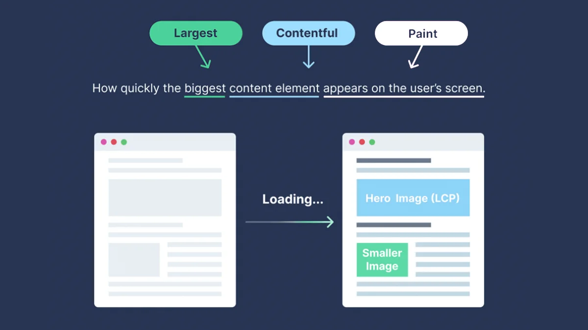
Largest Contentful Paint (LCP): Measuring Loading Performance
Largest Contentful Paint describes how quickly the main content of a page appears on the screen. In practical terms, it answers the question of how long a user has to wait before the most important element, such as a hero image or a headline, is visible and readable.
This metric is heavily influenced by server response times, how well images are optimized, the presence of render blocking scripts, and how you use lazy loading. When these parts of the stack are slow or misconfigured, the primary content takes longer to show up, even if the rest of the page structure is already in place.
Lighthouse and PageSpeed Insights continue to highlight LCP as one of the most important measures of perceived performance. A slow LCP usually signals that visitors are staring at a nearly empty or incomplete page while they wait for the most meaningful content to render. That moment of waiting can create frustration before the user has even had a chance to interact with the site.
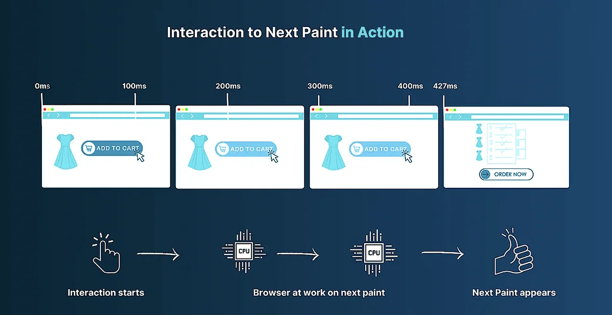
Interaction to Next Paint (INP): The New Standard for Responsiveness
First Input Delay has been retired in favor of Interaction to Next Paint, and INP is now the main responsiveness metric in modern performance audits.
INP measures the time between a user action and the moment the interface visually responds. It looks at interactions such as clicking a button, opening a menu, or typing into a form, and then tracks how long it takes for the browser to present the corresponding visual update.
Unlike FID, which focuses only on the first interaction, INP considers interactions throughout the entire page visit and pays particular attention to the worst ones. This makes it a far more realistic indicator of how responsive a site feels during real use. Instead of only optimizing for the first click after load, teams must now think about responsiveness across the whole journey, from initial interaction through deeper navigation and repeated actions.
This shift reflects a broader move toward truly user centered metrics that match how people actually experience web pages, rather than metrics that only describe a brief moment around the initial page load.
Cumulative Layout Shift (CLS): Ensuring Visual Stability
Cumulative Layout Shift measures how much visible content on a page moves around unexpectedly while the page is loading or updating. Most users have encountered this problem when they try to tap a button or a link and, at the last second, an ad or another element loads, pushing everything down so that the wrong element is clicked.
Sites that rely heavily on dynamic ad placements, auto loading widgets, or embedded media are particularly prone to layout shifts. Without careful design, elements may appear late, push other content out of place, or resize in ways that surprise the user.
Consistent optimization of CLS, such as reserving space for images and ads, avoiding inserting new content above existing content, and handling fonts and animations carefully, creates a more stable and predictable experience for visitors. Stable layouts are easier to interact with, reduce misclicks, and signal to Google that the page maintains a reliable visual structure.
Why Web Vitals Still Matter for SEO
Web Vitals still matter for SEO because they are grounded in UX research, not arbitrary targets. For example, keeping Largest Contentful Paint (LCP) under 2.5 seconds for at least 75% of page loads is tied to when users generally perceive a page as “loaded enough” to start their task.
Analysis of millions of page impressions shows that when sites meet the Core Web Vitals “good” thresholds, users are about 24% less likely to abandon page loads, with similar reductions on news and shopping sites specifically.
Those lower abandonment rates translate into more completed visits, more conversions, and stronger engagement signals, which Google’s ranking systems are designed to reward. Official documentation on Core Web Vitals states that achieving good scores supports success in Search and aligns with what core ranking systems “seek to reward.”
In short, Web Vitals link concrete thresholds like LCP ≤ 2.5s, INP ≤ 200ms, and CLS ≤ 0.1 at the 75th percentile to measurable gains in user retention and business outcomes, which in turn support better organic visibility.
Introducing Lighthouse and PageSpeed Insights
Lighthouse
Lighthouse is an open source auditing tool from Google that checks how a single page performs across performance, accessibility, best practices and SEO. You give it a URL, Lighthouse loads the page in a controlled environment, runs a series of audits, then scores how well the page did and explains what is slowing things down or hurting quality. The official docs describe it as an automated way to improve the overall quality of web pages, with support for both public and authenticated sites.
The easiest way to use Lighthouse is inside Chrome DevTools.
- Open the page you want to test

- Open DevTools (F12)
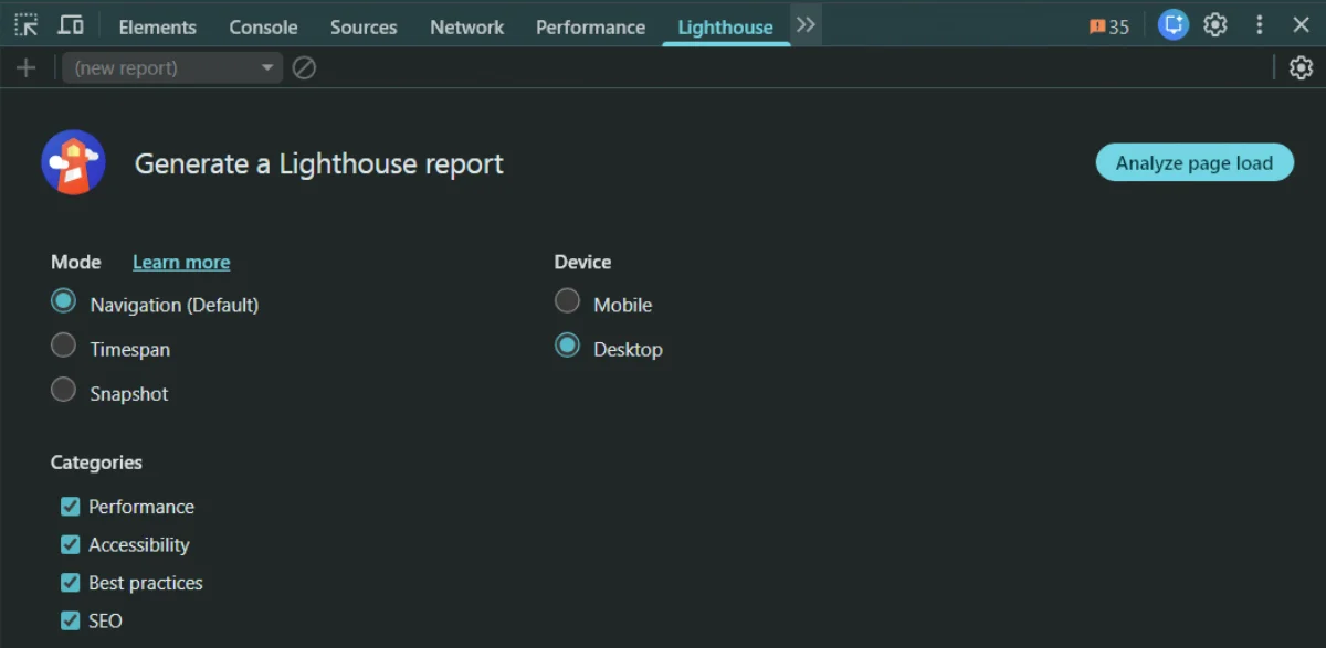
- Switch to the Lighthouse panel
- Pick mobile or desktop and select the categories you care about
- Start the audit by clicking Analyze page load
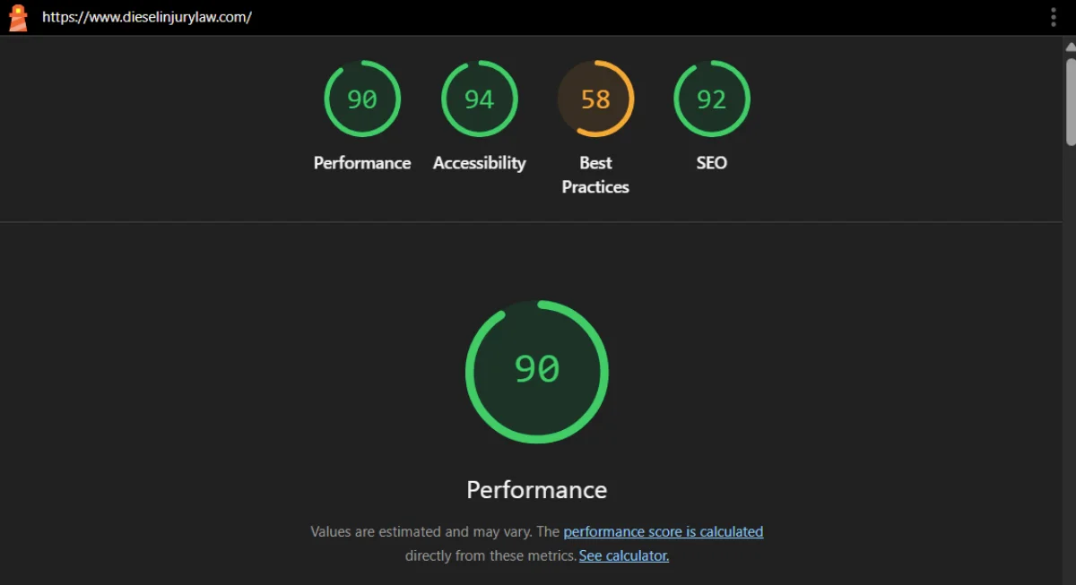
Lighthouse spins up a special Chrome session, simulates device and network conditions, records a trace of a single page load and then generates a report. At the top you see a 0 to 100 score for each category, followed by metrics such as Largest Contentful Paint, Cumulative Layout Shift and Total Blocking Time, plus screenshots and a list of passed and failed audits with links to documentation on how to fix each issue.

Summary of the Lighthouse test
Lighthouse reports are based entirely on lab data from that one synthetic run rather than long term user history. During the audit it applies network and CPU throttling to emulate realistic but repeatable conditions, for example simulating a mid range mobile device on a slower connection when you choose the mobile mode. From the captured trace it calculates timing and layout metrics and feeds them into a scoring model that blends several metrics into the overall Performance score. This makes Lighthouse a reliable way to test changes during development and to catch regressions before they reach users.
Beyond DevTools you can run Lighthouse in several other ways. There is a Node based command line interface that you install with npm, which is ideal for scripting and continuous integration.
How to Install and Use It
You typically install it globally on your system to run it easily from any directory:
Installation:
npm install -g lighthouse
Usage:
lighthouse
For example, to audit Google’s homepage:
lighthouse https://www.google.com
This will run the audit and output the results directly to your terminal or generate an HTML report file, depending on the flags you use.
The same engine is available as a Node module if you want to integrate it directly into build tools, and there is also a Chrome extension you can install from the Chrome Web Store that lets you trigger audits from the browser toolbar.
PageSpeed Insights
PageSpeed Insights is a web based service that measures how a page performs on mobile and desktop and gives recommendations for improvement. It uses Lighthouse for its lab tests and combines that with real user data from the Chrome UX Report, so you see both synthetic and field performance for Core Web Vitals in one place.

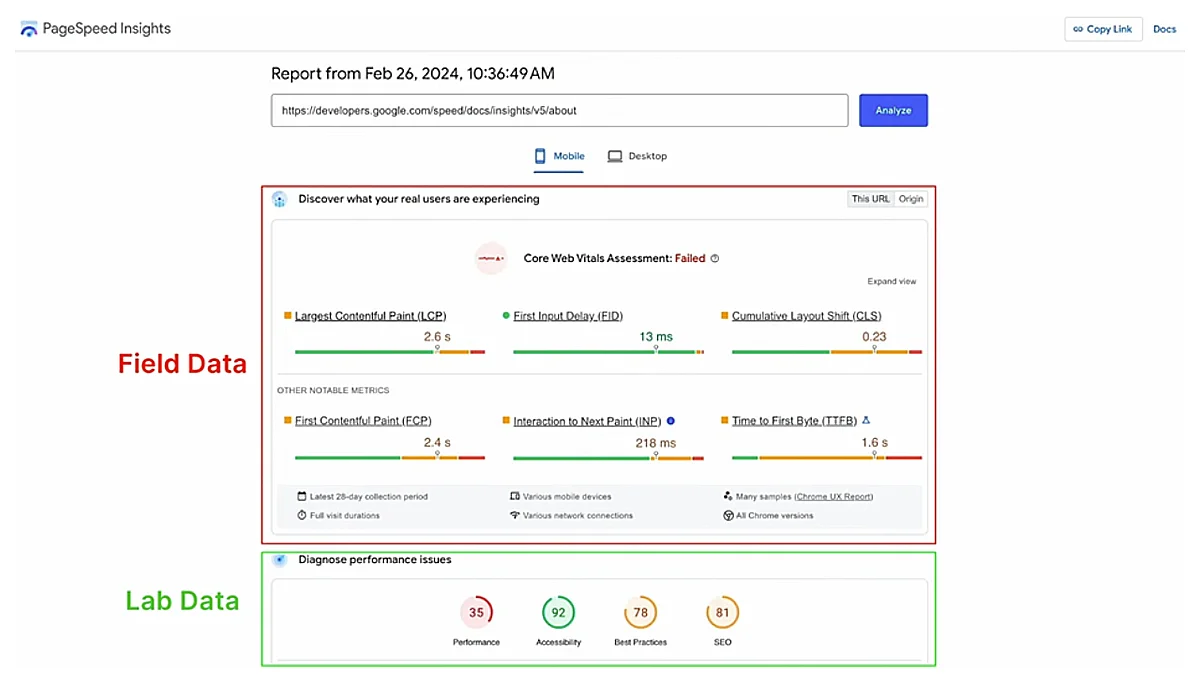
When you open PageSpeed Insights at https://pagespeed.web.dev/ and run an analysis, the first thing you see is the choice between mobile and desktop tabs at the top of the report. Each tab shows the same structure for that device type. The page is then split into two main sections: a user experience section based on real users and a diagnostic section based on a single synthetic test.
The first, upper section is the field data box. It is labeled as real user experiences and is powered by the Chrome UX Report. This data aggregates visits from many real Chrome users over a rolling 28 day window and shows how they experienced your page and, if available, your entire origin. The key numbers here are the Core Web Vitals at the top: LCP, INP and CLS, followed by other metrics like First Contentful Paint and Time to First Byte. All values are shown at roughly the 75th percentile, and you can switch between URL level data and origin level data when both exist. If there is not enough traffic for a specific URL, PSI falls back to origin data. This field section is the same CrUX data Google uses when it evaluates Core Web Vitals for rankings.
The second, lower section is the lab data box. It is labeled as a Lighthouse diagnosis and is based on a single run of the Lighthouse engine against your page. PSI loads your URL on Google controlled infrastructure under fixed, throttled conditions that simulate a specific mobile or desktop profile and records metrics like LCP, INP and CLS in that controlled environment. This synthetic run is what produces the familiar performance score and the list of opportunities and diagnostics. Because it is just one emulated page load, the values often differ from the averages in the field data above, which come from many real users on many networks and devices. Lab data is ideal for debugging and for testing experiments, while field data is the source of truth for how users and Google actually experience your site.
When you click Analyze, both sections are prepared at once. PageSpeed Insights first queries the Chrome UX Report to retrieve the latest 28 day aggregation for the tested URL and its origin. At the same time, it runs a fresh Lighthouse audit in real time to generate the lab report. The result is a single page where the top half shows how fast the page feels for real users over time and the bottom half shows what a single, standardized test run sees and how you can improve it.

When to Rely on Lighthouse vs PageSpeed Insights
Lighthouse and PageSpeed Insights use the same engine for lab tests, but they answer slightly different questions. Lighthouse focuses on one controlled page load so you can debug, iterate and guard deployments. PageSpeed Insights combines that same lab run with 28 days of real-user data from the Chrome UX Report (CrUX), making it better for understanding how your site actually behaves in the wild and how Google sees your Core Web Vitals.
| Aspect | Lighthouse | PageSpeed Insights |
|---|---|---|
| Data source | Pure lab data from a single synthetic run in a controlled environment (emulated device + throttled network). | Field + lab: CrUX real-user data at the top, Lighthouse lab run below. |
| What it’s best at | Debugging and regression testing: seeing how code changes affect metrics under repeatable conditions. | Monitoring real-world experience: seeing if a page passes Core Web Vitals for actual users and how that changes over time. |
| Where you run it | Chrome DevTools, CLI, CI pipelines, Node module, or extension. Ideal during development and pre-launch. | Web UI at https://pagespeed.web.dev/ or via the PSI API, typically used on staging and production URLs. |
| Metrics focus | Full audit categories (Performance, Accessibility, Best Practices, SEO). Performance score blends LCP, INP proxy, CLS and other metrics from the trace. | Core Web Vitals and performance for real users (LCP, INP, CLS from CrUX) plus one Lighthouse run for diagnostics. |
| How often data changes | Every run can differ slightly because it is a fresh synthetic test; no historical memory unless you store results yourself. | Field data updates daily as a rolling 28-day window, so changes appear gradually and reflect traffic mix shifts. |
| Who typically uses it | Developers and engineers iterating on code, setting performance budgets, and catching regressions before release. | SEO specialists, product owners and performance teams checking if key pages meet Core Web Vitals and how Google’s page experience view is evolving. |
| When to rely on it | When you are building or changing the site: local dev, pull requests, staging, CI gates, “what happens if I change X?” questions. | When you are evaluating live experience and SEO impact: “are we passing CWV?”, “did that redesign help users?”, “how does this URL compare over time?” |
Why Your Scores Fluctuate
Core Web Vitals scores are not static. Even if you do not change a single line of code, numbers in Lighthouse and PageSpeed Insights will move around from run to run and day to day. This is expected, because both tools sit on top of a web stack that is constantly influenced by devices, browsers, connections, geography and traffic patterns. Google’s own docs and community threads note that performance scores are inherently variable and that small changes between runs are normal.
Every test is a snapshot of a moment in time. On that specific run, your page is loaded on a particular device, in a particular browser, from a particular location, over a particular connection. Change any of these and timings shift.
Device performance
Real users hit your site on everything from low-end phones to high-end desktops, and weaker devices run JavaScript and rendering more slowly, which worsens LCP and INP. Chrome UX Report and Search Console both split Core Web Vitals by device type (mobile vs desktop), highlighting that hardware differences and mobile-heavy audiences often lead to slower, less stable scores.
Browser and rendering engine changes
As Chrome and other browsers roll out new versions, they change how they schedule tasks, lay out pages, and decode images. That can make some pages slightly faster or slower between versions, even if you never touch your code. Google’s Core Web Vitals report documentation explicitly notes that a “widely-adopted browser version update” can shift your status because performance is based on actual usage data, not a fixed baseline.
Network variability
Lighthouse’s own docs explain that performance scores naturally fluctuate because of “inherent variability in web and network technologies,” even when the page itself is unchanged. Spikes in latency, brief packet loss, routing hiccups, or congested mobile networks all slow down TTFB and resource downloads, which in turn worsens metrics like LCP and INP for that particular run or group of users.
Geography and routing
A user close to your data center or CDN edge usually sees much faster TTFB and LCP than someone reaching your site from another continent, over more network hops and higher latency links. Lab tests often run from a single region, but field data in CrUX aggregates users worldwide, so regions that are far from your servers or poorly peered with your CDN can pull real-world metrics down even when local lab tests look good. Guides on lab vs field data and RUM specifically call out geography, routing and CDN edge placement as key reasons why real-user Core Web Vitals differ from synthetic tests.
Traffic mix and user behavior
Your audience is not fixed. Campaigns, seasonality or viral spikes can shift your traffic toward users on slower networks or weaker devices, which lowers the share of “good” Core Web Vitals in CrUX even if your code did not change. Core Web Vitals in Search Console and CrUX are explicitly based on all eligible real user visits over a rolling 28-day window, so any change in who is visiting (device type, connection quality, geography) will change the aggregated metrics you see.
Caching, CDNs, and content variability
Caching decides whether a user gets a “freshly cooked” page or a “preheated” one. A cold cache means the page or asset is not stored yet: the request has to hit your origin server, run application code, query databases, maybe resize images, and then send the response. Those first few hits are usually slower and can hurt LCP. A warm cache means the CDN or browser already has a ready-made copy, so it can return HTML, CSS, JS or images much faster, often from a nearby edge server. CDN and RUM guides point out that cache warm-up after a deploy, cache expirations, or aggressive purges can cause temporary drops in Core Web Vitals until traffic re-warms the cache. Differences between CDN edge locations and their local load add another layer of variation. On top of this, content variability (A/B tests, different hero images, personalized blocks, rotating ads) means some visitors get heavier pages or slower third-party responses than others, so their individual LCP and CLS are worse even though the URL is the same. Over a 28-day CrUX window, that mix of cold vs warm cache hits, different edges, and different content variants shows up as natural wobble in your field data.
Why Lighthouse Mobile Performance Scores Are Lower than Desktop
Google Lighthouse uses different testing profiles for mobile and desktop, which largely explains why mobile performance scores are often significantly lower. The mobile profile simulates a typical mid-range smartphone on a slow network, whereas the desktop profile assumes a high-performance machine on a fast connection. In practice, this means:
CPU Throttling: The mobile test applies ~4× CPU slowdown to emulate a ~$200 Android phone (e.g. a Moto G4). This reduced processing power makes JavaScript execution, HTML/CSS parsing, and rendering slower on mobile.
Network Throttling: The mobile test uses a “Slow 4G” network profile (roughly 150 ms latency, ~1.6 Mbps download, 750 Kbps upload). This high-latency, low-bandwidth connection means content (HTML, CSS, images, etc.) downloads much more slowly than on desktop’s unthrottled broadband.
Device Emulation: Lighthouse mobile emulates a smaller screen and touch device, but performance-wise the key differences are the throttled CPU and network. The desktop audit, by contrast, is run with no CPU or network throttling (assuming a wired connection).
Factors Affecting Mobile Performance Scores
Several technical factors contribute to slower Lighthouse scores on mobile. Many of these relate to how mobile devices handle the page load under Lighthouse’s throttling.
Limited CPU Power
The emulated mobile CPU is much slower, so tasks like JavaScript execution, style/layout calculations, and image decoding all take longer. A script that is trivial on desktop might clog the main thread on mobile, delaying paints. In fact, Lighthouse’s mobile CPU throttling causes CSS and JS files to “take ages to parse and execute,” greatly impacting FCP/LCP (CSS parsing in particular can delay rendering the first and largest content)
Slow Network Throughput
The 1.6 Mbps simulated download means large resources (images, scripts, styles) download slowly. High latency (150 ms RTT) adds extra delay for each request. This affects Time to First Byte (TTFB) and resource load times – a slow TTFB directly pushes FCP and LCP later. Every additional HTTP request or non-optimized asset hurts more under these conditions.
Page Weight & Assets
Mobile performance is very sensitive to the total page size and number of resources. Large images or video will significantly drag LCP on mobile due to longer transfer and decoding time. Likewise, heavy JavaScript bundles increase download time and CPU work (increasing Total Blocking Time and delaying interactivity). In short, pages that are “fast” on desktop often carry too much weight for a throttled mobile environment.
Render-Blocking Resources
Assets like CSS and JS that block rendering are especially detrimental on mobile. The browser must download and process these files before painting content. On a slow connection, multiple or oversized CSS/JS files can delay the first render by seconds. This “render-blocking” effect “reduces the FCP considerably”, and by extension can delay LCP if the largest element is also waiting on these files. Mobile devices amplify this problem because parsing the CSS/JS is slower, so the blocking time is longer.
Client-Side Rendering delays
Many modern sites rely on heavy client-side rendering (for example, loading a blank page and then populating content via large JS frameworks). On mobile, this approach is costly – the device must execute a lot of script before content appears. Thus, if the page relies on JS to display main content, FCP/LCP will be much slower on mobile. A desktop might handle a 2 MB React bundle quickly, but a mid-tier phone struggles, leaving users staring at a blank or half-loaded page for much longer.
Third-Party Scripts
Analytics, ads, and other third-party scripts can insert network requests and CPU overhead. Under mobile throttling, these can significantly delay paints (for example, an analytics script that blocks the main thread or a third-party font that blocks text rendering will hurt mobile FCP/LCP far more than desktop).
To summarize the above factors, the table below highlights how each one impacts Lighthouse mobile scores:
| Factor | Impact on Mobile Lighthouse Performance |
|---|---|
| CPU Performance | Mobile profile uses a throttled, low-powered CPU. Script execution and rendering tasks take longer, increasing times for FCP/LCP. Even parsing CSS/JS can significantly lag on a slower CPU, delaying content rendering. |
| Network Speed & Latency | Simulated Slow 4G network (≈150 ms RTT, 1.6 Mbps) means each resource download is slow. High latency also lengthens TTFB and handshake times. This pushes back FCP (no bytes = nothing to render) and delays loading of images/styles needed for LCP. |
| Page Weight (Assets) | Large page resources (images, videos, scripts) take much longer to transfer and process on mobile. A big hero image or bloated JS bundle that a desktop loads in 1 s might take 5–10 s on mobile, directly worsening LCP and other metrics. |
| Render-Blocking Content | Mobile browsers must wait for critical CSS and synchronous JS to load/execute before painting. Under throttling, unoptimized CSS/JS can block the first content for a long time. This greatly slows FCP, since the browser may be idling until these files are ready. |
| Client-Side Rendering | If a page relies on heavy client-side JS to construct content (SPA frameworks, etc.), a throttled mobile CPU will delay the content render. FCP is pushed back until initial scripts run, and LCP is delayed until the JS inserts the largest content. |
| Third-Party Scripts | Excess third-party scripts (ads, analytics, widgets) add network requests and execution overhead. On mobile, these often load on slower connections and run on the main thread, contributing to longer Total Blocking Time and possibly interfering with timely paints. |
Each of these factors disproportionately affects the mobile test. The result is that mobile Lighthouse exposes performance issues (slow server responses, unoptimized assets, render-blocking patterns, etc.) that might be masked on desktop. It is by design – Google wants developers to optimize for the tougher conditions that many real mobile users face.
Conclusion
The temptation is to chase perfect scores, but the real goal of Web Vitals is consistent, predictable user experience. Slightly fluctuating numbers around a healthy range are normal and acceptable. Users care far more about whether your page usually feels fast, stable and responsive than whether it scores ninety two or ninety five on a synthetic test.
By understanding why scores move, focusing on trends instead of single runs and using Lighthouse and PageSpeed Insights for what each does best, you can treat Web Vitals as a practical quality signal rather than a stressful scoreboard. The objective is not perfection on every test. It is building a site that feels reliably smooth for real people, which in turn supports stronger engagement, better conversions and more durable search performance.
If you are looking for a team which can assist you with WordPress website optimization do not hesitate to contact click5. We have experience and tools to make your website page load times lighting fast.

